Wall Color Trends for 2022
Did you know APC has a monthly magazine? Claim a subscription for free at the top of the website!
28 February, 2022


Did you know APC has a monthly magazine? Claim a subscription for free at the top of the website!
28 February, 2022
As we brace for yet another year of pandemic polemics, home has become more than “where the heart is.” It’s where the business is, where the school is, and where the contractors are as people invest in heart, home, and school. While some contractors shy away from discussing color, knowing the color trends and understanding how to describe it are just more tools you can employ to set yourself apart and to provide your clients with information to make an informed decision; remember they are living with the emotions and inspirations of that color long after the final handshake. Even if you don’t use the brands noted in this article, check out their commonsense approach to where color is going in 2022 — and be prepared for a couple of surprises.
To open, Monique Le Mare-Rogers of The Paint Hive, an online decorative painting school and resource, shares her perspective on this year’s color trends and how contractors can incorporate them into more decorative — and more lucrative — design ideas.
By Monique Le Mare-Rogers, founder and marketing strategist for The Paint Hive
I have been working on upcoming interior and color trends by exploring macro trends, lifestyle changes, global changes and how they impact design and color. As we enter 2022, we are still in a state of transition, and the interior color trends represent hope, optimism, retro, sustainability and renewal.
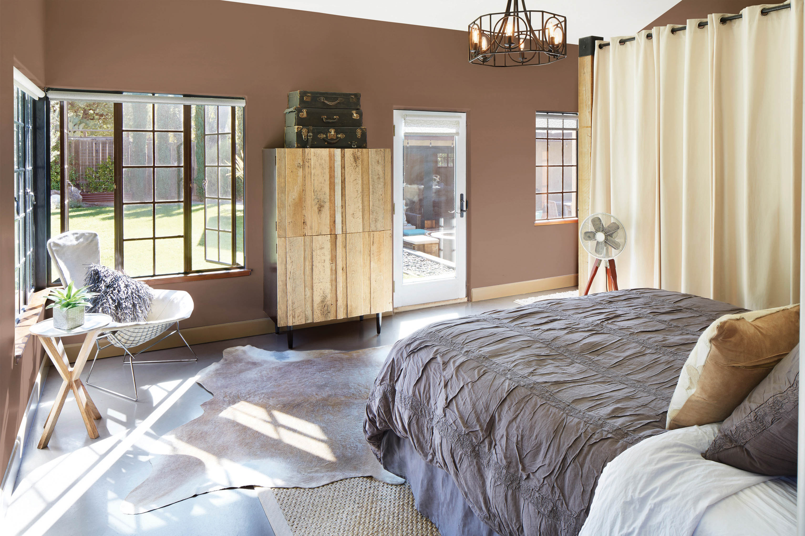
Over the past two years, our world has been irrevocably shaped by the pandemic. Our homes have become our place for everything. Past color trends reflected the comfort and stability we all craved. Our new habits, lifestyles and general mental well-being will continue to influence how we choose to paint our homes. The Landscape Palette that has become so important will continue to trend through 2022. Green is the color of nature and positivity. Although there will be a shift away from neutrals, the natural earthy tones such as clay and terra cotta seen within the Landscape Palette will remain.
Many of us continue to work from home, so the colors that we surround ourselves with becoming backdrops for more than just Zoom meetings — they become the proxy for our personal branding and mental well-being. In the upcoming months, we will begin to see bolder, brighter colors with some zest. Vibrant pinks, yellows and periwinkle are on the horizon. WGSN’s [Worth Global Style Network] color of the year for 2022, Orchid Flower, is a saturated magenta and is described as intense, hyper-real and energizing. Pantone’s color of the year for 2022 is a new color combination. Veri Peri is a periwinkle that is described as a warm, whimsical color that fuses a reliable blue and a violet-red undertone into one exciting shade. Color Marketing Group has designated two key yellow colors for 2022. Hope, a clear yellow with low chromaticity, is described as a hue destined to define comfort. Sunny-Side Up is said to appear to radiate shimmering light and is destined to represent the empathetic side of humanity.
The broader trend of returning to handcrafted and conventional application methods means the resurgence of hand-applied finishes. Color washing and textured color will have a strong presence in the coming year. Finishes to watch for include limewash and venetian plaster, with an appreciation for traditional techniques such as tadelakt (waterproof plaster surface) and adobe finishes. Additional techniques — either abstract and rough or rhythmical and controlled — using a brush, sponge, spatula, comb and more are once again being explored to deliver dimension, texture and movement to interior spaces.
Hand-applied finishes are a premium added service that require a decorative painter. Consider upskilling yourself or your crew to keep this lucrative service in-house.
Monique Rogers is a former co-owner of Modern Masters and Ritins Studio. On-demand training from The Paint Hive can be found online and is self-paced. Visit thepainthive.com for more information on these classes as well as continual shares of upcoming interior and color trends.
Erika Woelfel, vice president of color and creative services at Behr Paint Company, tells us that we’ll be seeing a lot of earthy colors in 2022. Natural colors such as taupes, browns, greens and blues will take center stage as people want to calm down by bringing natural colors indoors. “While people were sheltering at home, creating more comfortable and easier living spaces, a connection with nature was very important and became a big driver behind the color trends we’re seeing today,” she said. Below are some observations you can share with customers as you move through the year.
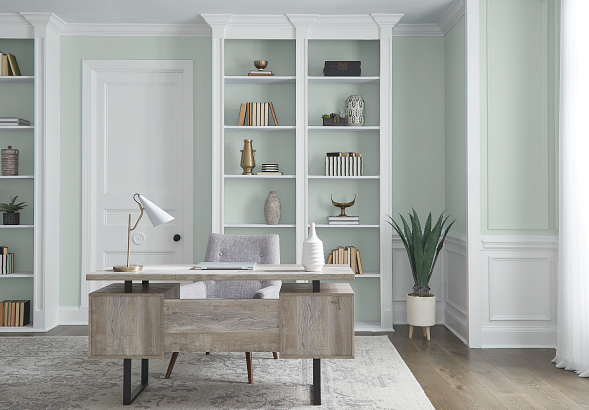
Benjamin Moore’s Color Trends 2022 palette leads off with its color of the year, a sage-shaded October Mist. It can lead your customers as well, as a starting point in imaginative use of the other 13 colors in its calming palette. From refreshed primary colors to luminous pales and botanical hues, the Color Trends 2022 palette invigorates the senses and gives root to personal style. The palette is harmonious yet diverse, and with just 14 colors, your customers can be on trend without feeling overwhelmed by too much choice.
“As the spaces in our homes continue to evolve, we uncover more opportunities to express our individuality and leverage the power of color to design environments that serve different functions and styles,” said Andrea Magno, Benjamin Moore director of color marketing and development. “October Mist and the corresponding Color Trends 2022 palette reflect an effortless harmony of colors, while inspiring unique combinations for any paint project.”
Companion colors include Wild Flower, a shade of red dusted with pink and orange; Hint of Violet, a lilac influenced by a cool gray; and Morning Dew, a soothing gray with a touch of green.
The palette colors were drawn from everyday observations, hobbies, personal rituals and cultural influences. With that in mind, you can encourage experimentation and combinations that go with any design style.
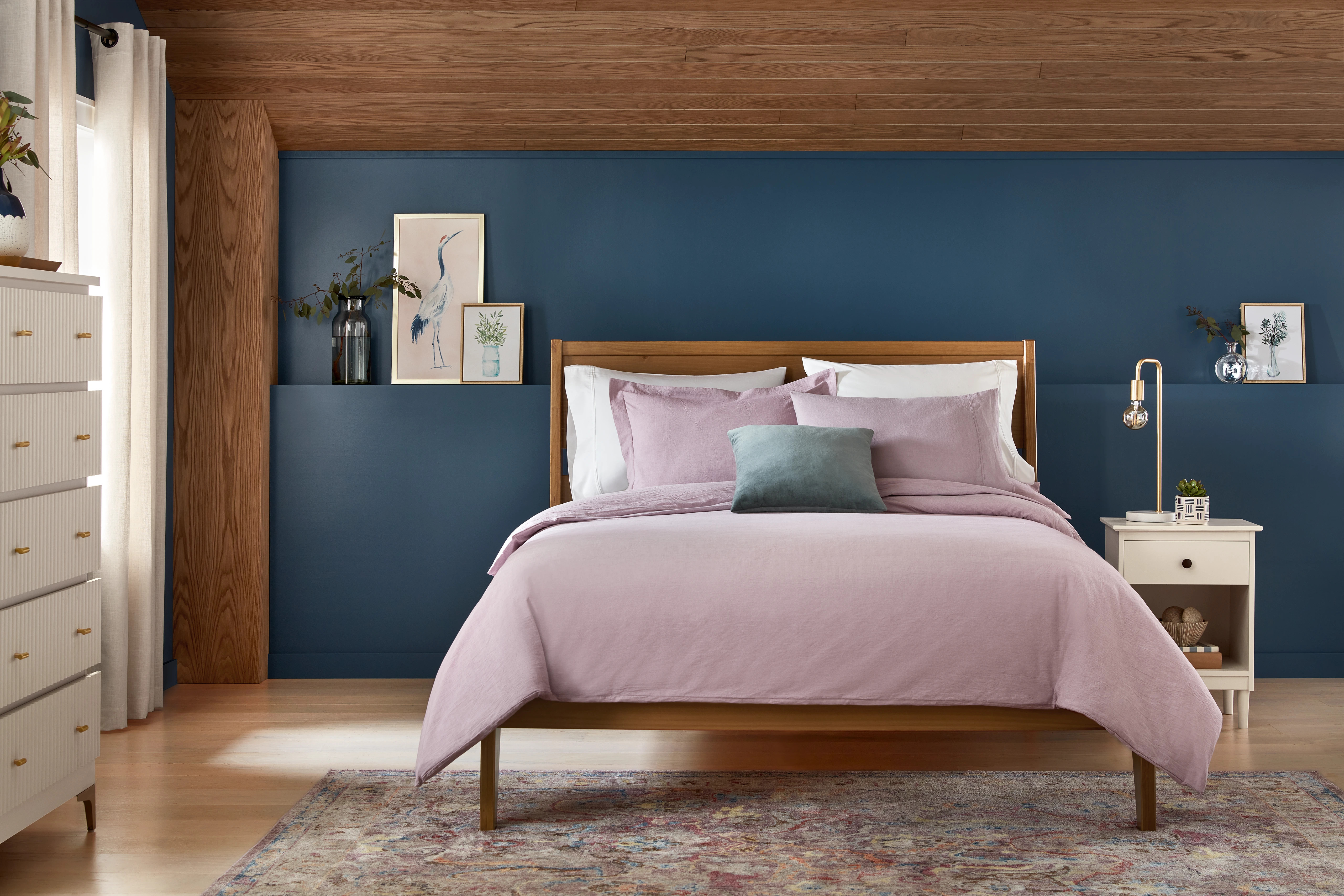
Blue is a color that inspires trust and loyalty, and this deep blue might just get you a bit of both when you recommend it to an interested client. Zenith, Diamond-Vogel’s 2022 Color of the Year, is inspired by the power of the ocean and the quiet beauty of the sky’s last light.
“This color frees our spirit and makes a statement of strength and empowerment while offering quiet beauty that connects spaces, cultures and generations,” says Sandy Agar-Studelska, Diamond-Vogel’s marketing manager. “This serene hue evokes feelings of peaceful confidence, compassion and courage, all-important today as we navigate through and reinvent many aspects of our lives.”
Along with the home, Zenith is a winner in commercial spaces as well, where it’s more important than ever to keep visitors calm and serene. “Zenith’s creative spirit delivers inspiration to both residential and commercial interior and exterior spaces, offering a welcoming, friendly hello as well as staying power with confidence and uplifting energy,” says Agar-Studelska. “Zenith pairs well as an accent with Diamond Vogel’s 2022 Trend Colors, providing a distinct statement when paired with neutrals and near-whites. As a grounding color, it complements greens, soft blues and yellows.”
As more painters and contractors look to the craftsmanship side of painting, Dunn-Edwards’ color of the year serves as a backdrop for craft and creativity, be it from yesterday or yesteryear. Art and Craft a timeless, versatile hue with an earthy, sophisticated quality — the perfect color for showcasing handmade objects and works of art. Inspired by academia, 17th-century painters, cottagecore and artisans everywhere, Art and Craft is a great choice for clients who enjoy creating their own art or displaying interesting items throughout their home.
"Art and Craft features the need for experimentation in handicrafts — the rethinking of design skills through a prism of technological development and upcycling to develop a new experimental style,” says the company’s color stylist Sara McLean. “An appreciation for nature brings with it a newfound desire to know where our products come from, and the processes used to make them.”
It's a new take on a traditional color, she continues, describing it as “a nature-based hue that is moody and complex.” And it won’t go out of style anytime soon. “The sophisticated darkness of this color is destined to make it become a new classic; a foundation color that ties other colors together. It makes us feel tied to the earth and nature’s seasons, evoking another era that highlighted arts and crafts,” said McLean.

Farrow and Ball, based in Dorset, England, is known for high-end paint and a limited but fascinating color palette. Joa Studholme, the brand’s color curator, predicts that 2022 will be a year which homeowners are looking to apply simple and familiar colors but in clever combinations. Farrow and Ball’s 2022 palette features five colors — Babooche [yellow], Stone Blue, School House White, Incarnadine [red] and Breakfast Room Green — to help you comfort your customers through color.
“There is something inherently human in the colors that we are attracted to for 2022, as well as in the way we use them,” says Studholme. “Décor is moving forward while drawing inspiration from the modest character of the world of folk and craft. We are offering five significant shades that extol the virtues of a simple life and can be used in any combination and in any room. They are an eclectic mix of the pure and the humble that evokes the warmth and harmony of a more innocent age while celebrating life today. Function goes hand in hand with ornament, using colors and finishes in unusual ways to celebrate the principles of utility, kindness and honesty.”
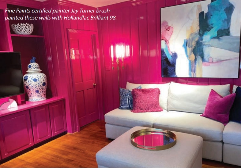
Fine Paints of Europe is going all out to buck the trend of the calm and peaceful palette. What used to be called Shocking Pink returns to the stage as Pink on the Brink, Fine Paints of Europe’s 2022 Color of the Year.
“Pink on the Brink pushes the limits and puts a glam spin on this comfort classic,” says Emmett Fiore, Fine Paints’ color strategist. “Pink is an inherently soothing shade, so you can go vibrant and vivacious while still fostering a cozy vibe.”
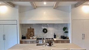
While it can go into a whole room, as you can see from the photo, Fiore also recommends it in small spurts — the front door, an accent wall, even the ceiling for a spicy overhead treat. “This funloving fuchsia will transform any room or nook into a favorite space for brainstorming,” he says. “It really rocks out when paired with hyper-hues such as cobalt, green, gold, purple or black, and it mellows out with white, cream, tan or gray.”
Pink on the Brink pushes the limits and puts a glam spin on this comfort classic.
Kelly-Moore is skipping Color of the Year for 2022. “It’s fun, but it doesn’t really capture the essence of the trends we’re seeing or how to use them in our homes,” said Shannon Kaye, the company’s color marketing manager. “At Kelly-Moore, we love sharing a broader look at color trends and design styles we see coming in the new year.” Among those are some upbeat developments in greens, yellows and blues.
“One beautiful trend we’re excited about is the range of greens taking cabinets and walls by storm,” said Kaye. “Look for greens that make you feel happy and plant them into almost any current design trends, from midcentury farm style to bohemian chic. To make these colors chic, look to vintage lighting, white cabinets, brass or black fixtures, and maybe another jewel tone or two for added sophistication.”
For clients who are “hungry for change,” Kaye recommends some yellows influenced by popular foods and spices. “Yellow is the color of optimism and personal power, and we’re seeing this popular hue begin to shift from slightly citrus to rich yummy versions of mango, saffron and chili powder,” she said.
Another trend positions blue as “the new black.” Look for rich hues such as indigo, cobalt and deep sea to take the place of black for everything from dark rooms to punchy pillows and traditional dishware
Many paint companies, such as Miller, Rodda, Cloverdale, Richards and California, share a color palette, and they’ve named Desireé their 2022 color of the year. A softly shaded orchid hue that is reminiscent of the first signs of spring, Desireé was inspired by a renewed connection to the natural world
“With 2021 coming to a close and a shared desire for hope and healing, Desireé is a point of light and warmth, calling on us to pause and reflect,” says Puji Sherer, director of color marketing for Miller Paint. “A collective wish for new beginnings leads us to thoughtful hues that support renewal, reflection and a sense of optimism in 2022.”
It’s a versatile color that’s a great recommendation for customers who want to move away from neutrals. “Desireé proves versatile and complex, with a brightness that offers a coloristic surprise in places like entryway doors loaded with architectural detail,” says Sherer.
The softly shaded lavender Desireé is designed to express these hopes [of optimism and renewal] and bring dreams of renewal to life,” adds the team at California Paints. “The subtle floral mood of Desireé makes it an ideal choice, whether you prefer contemporary styling or vintage décor.”
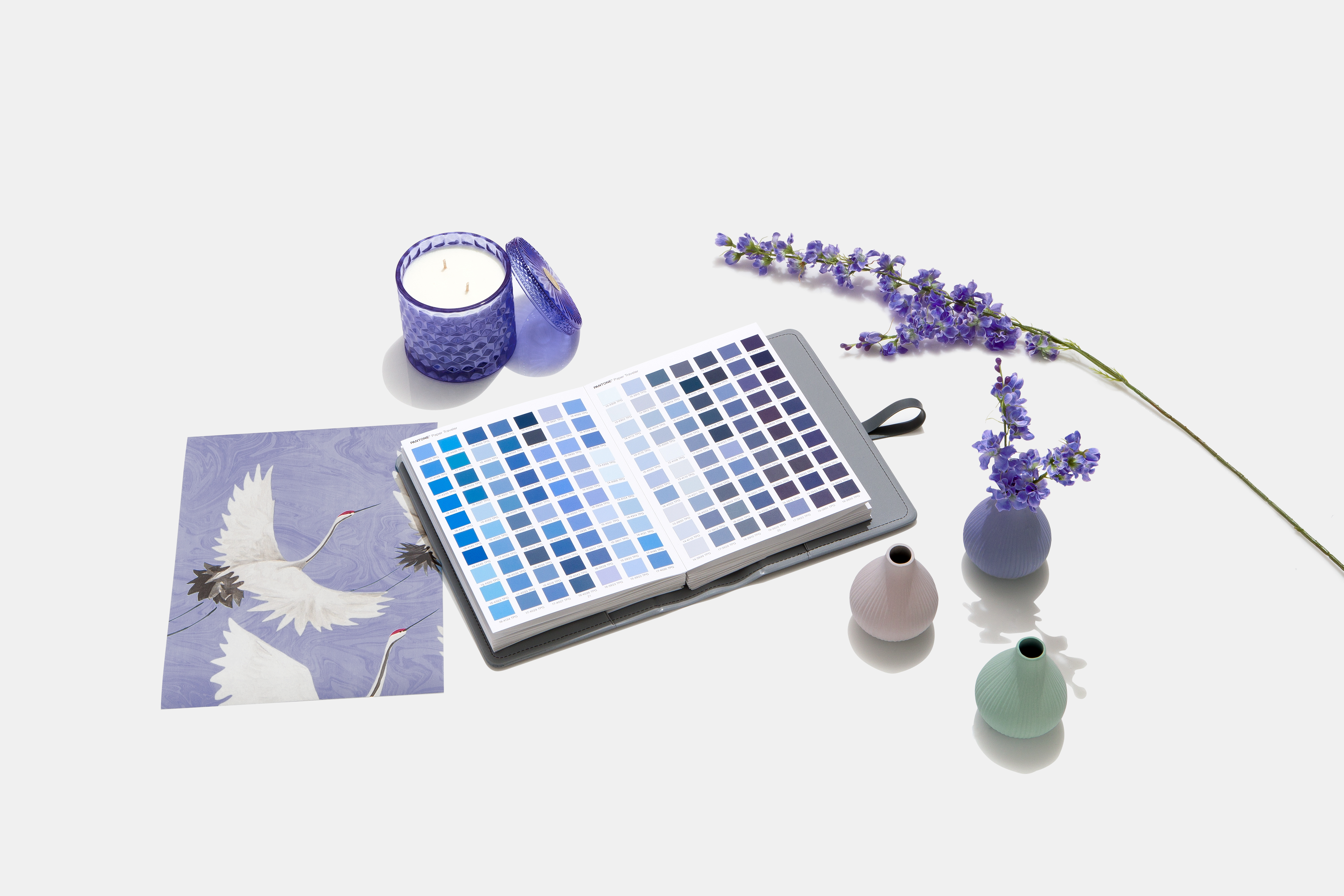
Pantone’s color of the year, the deep purple Very Peri, is more playful than peaceful and may go well with the current edition of home furnishings. Pantone’s color experts see this color trending not only in paint but in fashion, makeup, fabric and in other industries where color plays an important role.
Where paint and décor are concerned, Pantone suggests its strength as an accent color. “Very Peri injects a sense of playful freshness into home interiors, enlivening a space through unusual color combinations,” says Leatrice Eiseman, Pantone’s executive director. “It is suited to an array of different materials, textures and finishes, providing a pop of color, whether introduced through a painted wall, accent furniture or home décor, or acting as an intriguing and eye-catching accent in a pattern.
"Displaying a carefree confidence and a daring curiosity that animates our creative spirit, Very Peri helps us to embrace this altered landscape of possibilities, opening us up to a new vision as we rewrite our lives,” says Eiseman. “Rekindling gratitude for some of the qualities that blue represents, complemented by a new perspective that resonates today, Very Peri places the future ahead in a new light.”
DIYers, property managers, designers and architects are shifting away from the stark, neutral palettes of yesterday and opting for color in all form,” says Amy Donato, senior color marketing manager, at PPG paint. “Call it rebellion, but we are certainly here for the resurgence of optimistic colors to guide us into a new era of home design.”
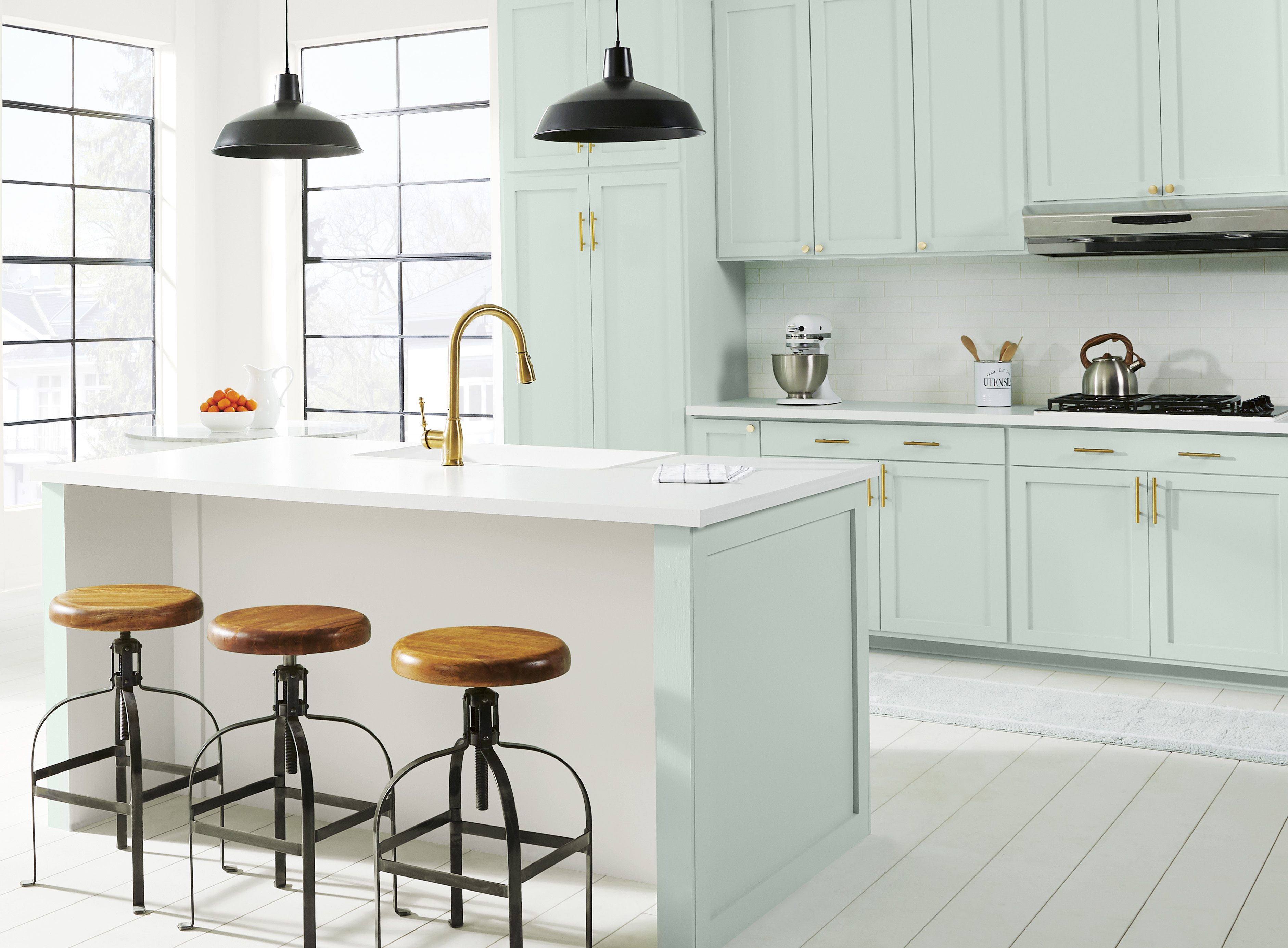
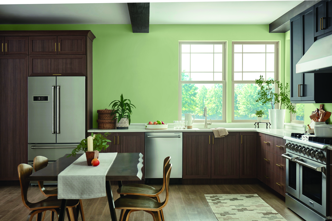
PPG is offering an olive branch, or at least a sprig, as its 2022 Color of the Year. Olive Sprig is a relaxed but enticing green that emulates the feeling of soothing aloe vera or a fragrant plant, brightening any space with organic liveliness. Its versatility allows it to blend in with any environment and also cater to a population that’s ready to participate in a more active lifestyle after spending so much time in hiding. Olive Sprig also pairs beautifully with brass accents and wood tones on an island or lower kitchen cabinets.
One trend overall, says Donato, is that as people are more likely working and learning from home, there’s been a move away from open-concept living spaces to individual rooms in order to create privacy and compartmentalize working life from personal. As a contractor, you can recommend painting a wall or nook a different color from the rest of an open space to help create compartments and boundaries.

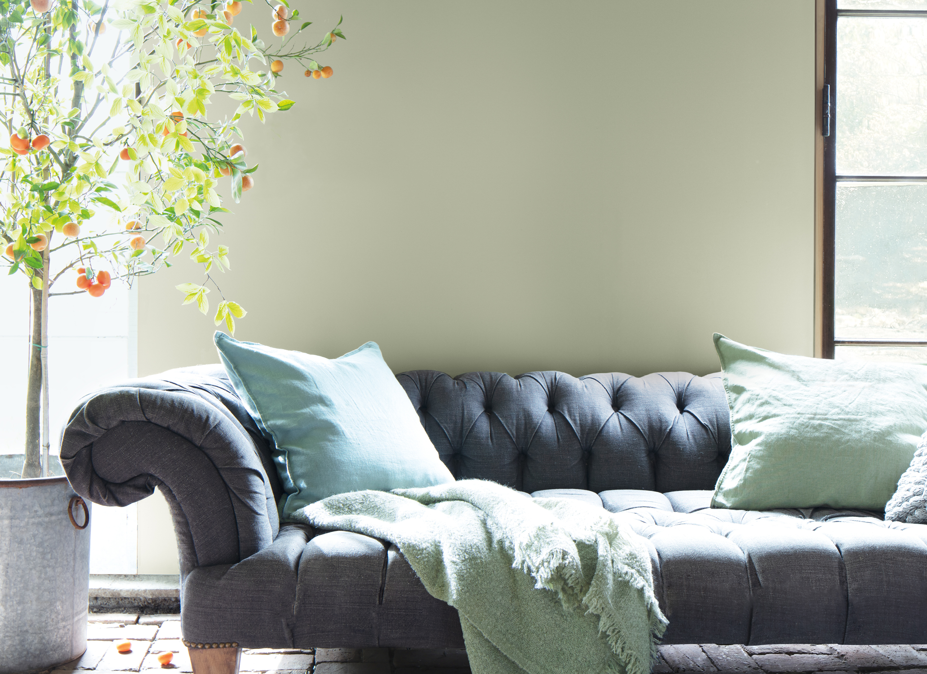
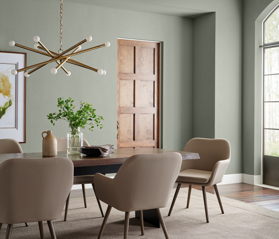
Pratt & Lambert’s 2022 palette is headlined by its Color of the Year Gray Mist, described as a soft sage with a gray suggestion. You might suggest it for people who are looking to simplify and calm down.
“Today, more people are embracing a slower pace of life and decluttering their living spaces — they are putting more time and energy into turning their homes into safe havens for retreat and rejuvenation,” said Ashley Banbury, senior color designer for Pratt & Lambert Paints. “Gray Mist is the perfect shade to uncomplicate a room with color that is elevated but not overwhelming. Our Color of the Year softens interiors and also works outside to create beautiful exteriors by harmonizing with classic whites and blacks. It’s a great choice for any décor style.”
Pratt and Lambert Paints’ complete 2022 color palette is inspired by nature’s energizing and restorative qualities. It began by researching global lifestyle trends from culture to fashion to technology, providing a fresh jumping-off point for forward-thinking colors. From uplifting yellow and blue hues to soothing rose and lavender tints, exuberance and optimism permeate this timeless collection.
Sherwin-Williams’ 2022 Color of the Year is Evergreen Fog, a nourishing, sophisticated and nostalgic gray-green, bringing us back home with an oldschool midtone following several years of cool neutrals and bold jewel tones. “Evergreen Fog is a sophisticated wash of color for spaces that crave a subtle yet stunning statement shade,” said Sue Wadden, director of color marketing at Sherwin-Williams. “Evergreen Fog inspires us to begin again and is a great choice for modern interiors and exteriors.” Use it to bring a soothing, subtle shade to any part of the home, indoors or out.
You can also recommend it as well for business and commercial spaces. It brings a regenerative touch to any environment, whether hotel room, restaurant or office,” said Wadden. In multiuse areas, this calming and composed color helps promote the versatility of the space. It’s also a winner in lounges and other areas used for rest and relaxation, and it provides a comforting welcome for entry areas and lobbies.
It also works well with other building and decorating materials. “You can create depth and texture with a mix of natural-looking textiles. Add a little gleam with a fusion of metals — champagne gold, warm brass or inky black,” Wadden encouraged. The color pairs well with organic neutrals such as Shoji White, Accessible Beige and Woven Wicker, along with tonal, luxurious hues such as Urbane Bronze, Über Umber and Bakelite Gold.
Valspar is continuing with its practice of choosing several Colors of the Year. “In 2022, we look to bring in colors that are comfortably familiar, derived from nature and empower us to move forward with positive outlook for the future,” says Sue Kim, color marketing manager. “Valspar’s 2022 Colors of the Year palette embraces colors that bring a calming warmth, balancing tranquility and uplifting energy to our multifunctional spaces in our homes.”
A good takeaway from this company is the idea that color can be a guiding factor in how your clients, many of whom are spending more time at home, can make that home more comfortable. This makes a contractor’s knowledge of color even more important. “We are seeking shades with depth to create a meditative space that also feels luxurious. Mountain River is naturally indulgent and Fired Earth is a classic shade that makes us feel protected,” says Kim.
Another recommendation is to bring the outside in, with colorful neutrals that evoke shades of nature, providing comfort for your clients without overwhelming them. “Blanched Thyme is a beautiful natural green, a shade that promotes positive wellbeing,” Kim describes. “Grey Suit is a natural grey with a slight red undertone, promoting balance bring together both cool and warm tones in our home.”


Add new comment